Before I even took out the painting supplies, I told Glenna, “I want to paint simcha, joy, happiness!”
“Really? Well, this matches perfectly with what quotes and samples I chose for today’s inspiration!”
Ya gotta love it when teacher and student are on the same wave length!
I took time today to switch from my work with words to work with paint. Earlier in the day I struggled with some of the business activities—writing pitches/marketing and computer login issues—and wanted a break. Additionally, it’s a joyful time of year and in my family, and I wanted to explore those feelings in art. But how?
While looking at Contemporary Painting by Charles LeClair, I learned about the five levels of perception of color:
- abstract
- representation
- material concerns
- connotation and symbolism
- emotional expression
Emotional expression grabbed me…that’s it! One painting in that section had dark hues, expressing grief and sadness. Another picture had a bright yellow house outlined in red…I smiled! The paintings evoked precise emotions.
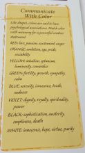
Then we looked at The New Creative Artist by Nita Leland where I saw a list of colors with their psychological associations (p. 87):
The associations fascinated me. Orange relates to sociability and ambition. I focused on the optimism and intuition of Yellow. One of the emotions associated with Red is excitement. Of course I was easily drawn to my favorites Blue and Violet. But today I was up for an experiment.
I’m excited and passionate about the joyous family events; should I paint in Red? It’s so unlike me.
I struggle with the business development and marketing aspects; should I try Orange to counteract my introvertness?
And I’m optimistic and Yellow makes me smile today.
I’ll move completely out of my comfort zone, away from my go-to colors and see what comes out.
I wasn’t sure what I’d place on the blank page…almost never am. Somehow shapes seemed the right form. But I wasn’t even sure which ones…until I saw the stars. I smiled when I saw those star stencils. And although I wanted to use orange, red, and yellow, what do I outline with? Glenna reminded me about contrasting colors with a quick refresher of Color Wheel 101!
I decided to combine watercolor pencils and watercolors to see what would happen. I love to watch the colors drip into each other.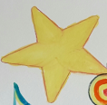 The water flowing from the strong red outline into the bright lemon yellow star created an interesting shade.
Then I gently stroked the water in the brush’s soft bristles over the purple outline and wisped that color into the medium yellow puffy star.
I softened the green outline with small amounts of water and slightly blended that with orange.
But what to do in the middle? I wanted something with circles or soft round edges to offset the starts. We looked for the butterfly shape I’d used once and couldn’t find it. I guess I’m not supposed to paint butterflies today; what else could I use? I saw the curly-cue shape…that’s it! 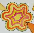
I got excited by the shapes and contrasts. I even experimented with a rose shade of a different type of watercolor. As I looked at the curly-cue shape and the lines I’d painted, I realized that unwittingly the abstract perception of color from LeClair’s influenced my work today. The shape looks deeper as I focus on each row of color.
But what to do in the lower right corner? Perhaps some free-hand drawing? Perhaps something easy that I enjoy painting?
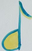 Musical Notes! Why not! I’ve painted music before! Looking at my color wheel, I found the contrasting colors and painted them into this picture.
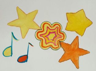
The results astonished me! Contrasting shapes, bright colors, symmetry, and large white spaces.
- The contrasts bring me into the painting. Abstract lines give my eyes plenty to look at; there’s lots of variety.
- I noticed how white space/negative space is as important in art as it is in the written word. The white space allows my eyes to rest.
- There’s symmetry with the three connected shapes.
- The puffy star is off on its own.
- And the musical notes balance the piece.
What do I really see here?
My eyes focus immediately on the curly-cue shape; the alternating colors draw me so that suddenly I’m focused on the yellow center that’s surrounded by rose. I could be either the yellow or orange star, attaching myself to a central force that’s always there. The center steadies me, much the way I turn to Hashem (G-d) several times during my day.
Once I have my center, I’m grounded and can move out to new territory. The puffy star moves away—perhaps a new idea whose time has come to fly off and bring me to new exciting places. Where are we headed? What will we see? I think with childlike wonder.
Or maybe that puffy star is an old belief or habit that no longer serves me…and it’s time to let that go. Goodbye! Thanks for traveling with me! Enjoy your new journey!
Possibly that puffy star is the child who is growing up and ready to take off in a new direction. That’s what’s happening in the family now; we’re at a joyous milestone! As long as that puffy star—I mean child—knows where his center his, knows his base, he’ll have a great journey! And I send him off with love!
And the musical notes? Simcha, joy, dancing, fun conversations, a beautiful flower…anything that makes my heart sing!
I’m given interesting circumstances; some are more challenging than I’d prefer. So I have a choice of how to respond. Why not choose joy?
**
The blog post honors—
- the Hebrew month of Adar; a month of pure joy where I deepen my connection through love and simcha!
- my first grandson’s bar mitzvah…a truly joyous milestone!
